Darkroom Variables – Spikes. Problem and Solution

What are spikes?

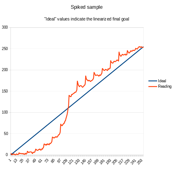
Spikes are sudden bumps in values, reading a step tablet test print used to calibrate a printing process. Spikes are detectable when they occur between the end of one row and the beginning of the next in a 101 or 256 step tablet. Spikes are wrong discontinuities that shouldn’t happen. Step tablets can be of many formats and with different numbers of steps; different step tablets are affected differently by the spikes issue depending on their format.

What problem do they cause?

Spikes change the real values in the test print of step tablets, and so is the correction curve needed to calibrate a process. If spikes are not very strong it is quite simple to smooth their values out, either using an automated software like the Easy Digital Negatives (EDN) tool or manually if you know what you are doing. When you have high and wide spikes you need some experience to manually smooth their effect out correctly, and if part of their effect remains, even in automated tools, the correction curve to perfectly linearize your process will be affected.

What is causing spikes?

  1. The main cause I discovered is water flow during development/wash.
  2. A secondary cause mainly affecting cyanotypes is peptisation.

The water or any other liquid that flows over a test print, inside a development tray, doesn’t move (flow) all at the same speed. There are variables such as tray dimensions, quantity of liquid used etc. that affect the flow more or less and therefore the spikes issue.
When you manually rock the tray, the water on the sides of the print moves at a different speed (compared to the center) because it finds the resistance of the paper. This type of altered flow creates a pattern where the sides of your test print will be washed a bit more than the center, especially because your developing/washing goes on for 15 or 20 minutes. If the sides of your test print are more washed off, there you have spikes indicating density values higher than expected.

Peptisation in cyanotype is an effect of chemical loss from an area. To avoid it, you need a black border around the step tablet (and avoid black texts around), and your sheet of sensitized paper has to remain within the black border during exposure.

“A phenomenon called the ‘edge etch effect’ was conspicuous on some peptisation step tests and requires explanation. This was the loss of image substance from the edges of a step, where it is adjacent to the surrounding regions of maximum density. That the effect is attributable to the adjacent area of high density was demonstrated by printing the step tablet up against the boundary of the sensitized area, in which case there was no loss. The ‘edge etch effect’ is invisible immediately after the print-out exposure; it only appears during the wet-processing. Nevertheless, it can be shown not to be due to migration of ions through the solution during the wet processing; because the effect still occurs even when the entire adjacent high-density region is cut off after exposure but before the wet processing. Evidently the loss is due to ions which have migrated through the paper from the adjacent area during the exposure.”

Mike Ware, Cyanomicon.

How can you avoid spikes?

As I specified earlier, the format of the step tablet is important.
The most affected step tablets are the “classic format” in square with 101 or 256 steps and the linear 21-step tablets.
To avoid the spikes you need to use special randomized step tablets with redundant values, like those used in the PiezoDN calibration system, or the new anti-spike 256 step tablet available inside the video course Digital Negative for Alternative Photography.

How are “classic formats” of step tablets affected by spikes?

A “classic format” of step tablet is normally a strip or a square composed of many different density patches.
As described above, a classic step tablet test print will most probably be affected by how you normally process it in the wet stage (development/wash). The square format of 101 or 256 step tablets is usually printed on a sheet of paper a bit larger than the step tablet size (normally 1 to 2 cm, or ½ inch around) and so, is affected by the water flow issue mentioned previously.
This is also true for the 21 step tablets made on a single row. The only difference with the square step tablets is that, in a single row step tablet, it is not possible to check the effect of the spikes by comparing the values with nearby cells, since you there aren’t any at its sides, but the reading of that step tablet might still lead to an incorrect correction curve when printed on small paper strips.
If we use a much wider sheet of paper and we place the step tablet negative in its center, the wash off effect on the border of the step tablet image is reduced. There remains the peptization effect if you print in cyanotype and you don’t use a wide black border around the step tablet.

How do some special step tablets work with no spikes problem?

PiezoDN and BTNS calibration systems, for example, use special step tablets composed of several steps of identical density, each one of them positioned randomly inside the tablet area, so that reading each one of those steps gives you the ability to average their values. In case one step of a specific density is affected by the spike (because of being washed off for its position), its value can easily be smoothed out by the values of the other identical steps inside the tablet.

Inside the video course Digital Negative for Alternative Photography you will find the new anti-spikes 256-step tablet that lets you print and develop in your usual way without worrying about spikes. It uses a larger array of steps to extend the printed area, in order to limit the bad effect of water flow, it has no labelling texts around it, but has a nice black border to avoid peptisation; it is also compliant with the required Easy Digital Negatives (EDN) calibration system format.

Would you like to contribute to this article?

Adopting a scientific method, doing all the tests that rule out the variables you may think of, and/or that I have already tested, and by consistently following the way you print your process, you may be able to discover a new variable and contribute new data on the spikes issue.

APPENDIX A – False causes I ruled out

I spent a long time analysing and testing, until I reached an understanding of the spikes issue, ruling out many popularly believed causes that are generally not a problem (except in very specific cases).

Printer
Using my Epson P600, I printed a step tablet negative in its normal upright position and then I printed it again rotated at 90 degrees on the same transparency film. If the cause was the printer printing denser at the edge where the print started (an explanation I was given, possibly for certain printers) I should have had no spikes at the beginning of the rows in the test print using the rotated negative, which in fact I still had. I performed the printer quality test, available on the EDN website, and the max error of my printer was detected as 0,7%, while my spikes were huge. Using a scientific approach, and measuring negatives with a transparency densitometer, John Isner (creator of the BTNS calibration system) has proved that the printers he used had no systematic error based on print location.

Coating inconsistencies
To determine if the cause was the coating (the rod leaving more emulsion on the edges or in other areas as stripes), I first positioned the digital negative parallel to the coating direction during exposure, and then rotated 90 degrees, doing different test prints. Coating was not the cause of the issue. Also, the EDN coating quality test always gave me the result “excellent” when using the rod.

Paper curling
To determine if the cause was the paper curling (letting the emulsion “slide” to the edge or having other absorption changes), I taped the paper down all around in many tests and also temporarily glued the paper entirely flat down before coating, letting it dry that way. Curling was not the cause of the issue.

Exposure
To determine if the cause was due to uneven exposure of my UV exposure unit, I measured via a Dose Meter that there was uniformity, and also made test prints rotating the digital negative 90 degrees under the exposure unit made with fluorescent tubes to prevent any banding, but I still had spikes at the beginning of the rows.

Relative Humidity
To determine if the cause was Relative Humidity (affecting paper absorption), I tested the paper under varying R.H. conditions and I always got the spikes. I tend to work in a controlled environment with a 70% RH average, using a dehumidifier when needed.

Drying after exposure
To determine if the cause of spikes was because of color drift while drying the developed paper, hanging it vertically, so that there could be a shift of densities on the print edges, I tried drying the developed test prints horizontally, but the spikes were exactly the same.

Fluid dynamics
I initially thought I ruled this variable out, but in a too simplistic way. This tells how easy it might be to test in the wrong way. Read more in Appendix B if you are interested to discover how I tested it.

APPENDIX B – Tests

In my calibration process and for the spikes tests I used Arches Platine, coated with a rod. By the time I made the last fifth or sixth pass, my emulsion was almost totally absorbed and the paper was just slightly shiny, as it should be.
To read the values of my test prints I used a scanner and the free tool available at the Easy Digital Negatives website. I also double checked the values by doing a manual reading. Peter Mrhar explained to me that the raw result coming out of his EDN tool is nothing but the value of the color in each square of the step tablet test print. The program does not affect these values in any way; it just reads them one by one. The data in the raw graph are therefore unchanged color data read before the correction curve is created. You will find a few of the EDN raw graphs further on.

About water dynamics in the wet process. Latest conclusive tests

While developing my cyanotypes I had noticed that the water inside a tray flows faster on the edges and slower at the center of the test print. In other words, the water washes more at the edges creating lighter prints at the edges due to wash off of exposed emulsion.

I decided to reprint my worst case test print of a 256 step tablet negative, but using a very different way of developing and washing.
I rolled my new test print inside a cylinder so that the full print was facing inwards. I rolled the print so that the sides, where spikes show up, were longitudinal to the cylinder and in doing so, both sides and center of the test print would be washed uniformly.
I filled a deep and wide bucket full of water and I held the cylinder with the print well inside the water.
I moved the cylinder constantly back and forth for 20 minutes, so that the washing water would flow inside it over the print and I would avoid any staining. The result was a well cleared test print with barely any spikes.
Below you can see a comparison of the values read from the two test prints, old and new.
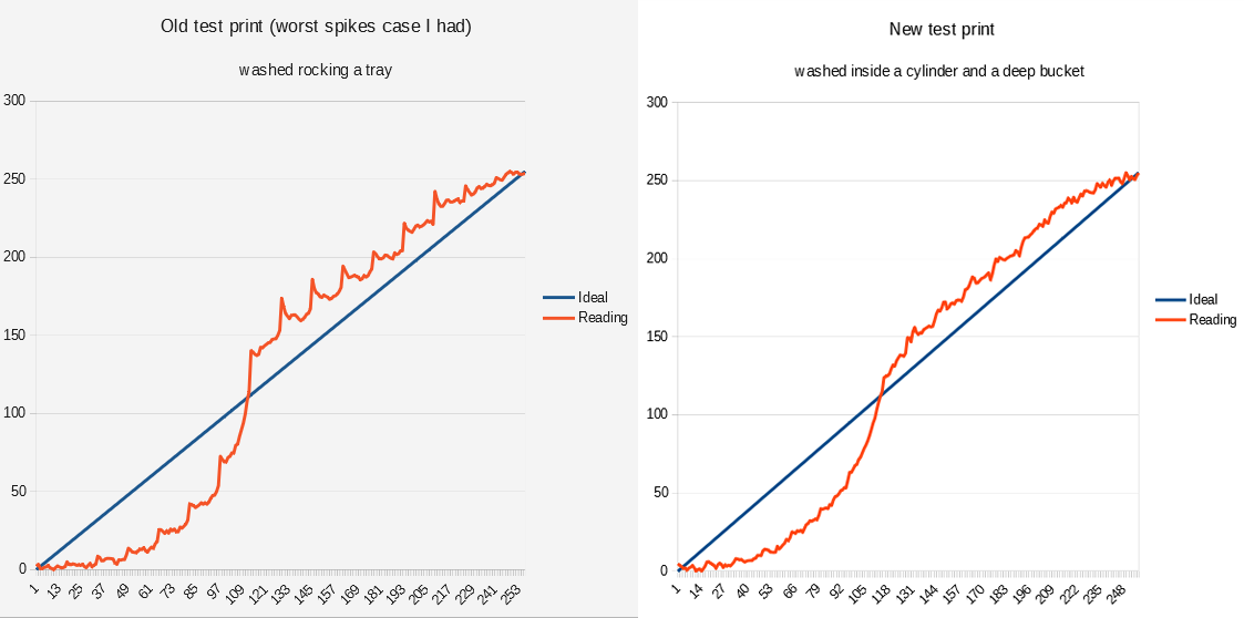
On the left, the values read from a test print of my worst case where spikes are very high,
and on the right, a new test print made using the same negative shows almost no spikes.

When I decided to start investigating spikes

Quite a while ago, I had to linearize a new batch of paper and so I made three new test prints, to average their values. I used the same step tablet negative to make the prints and all of them had evident spikes as you can see below.
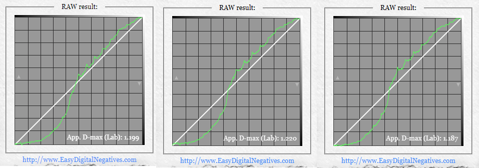
The spiked values read from three test prints I did on the same day using the same negative
called NEG23.

I then wanted to determine what caused the spikes and I printed again the same step tablet negative together with the EDN coating quality negative. See the two graphs below.
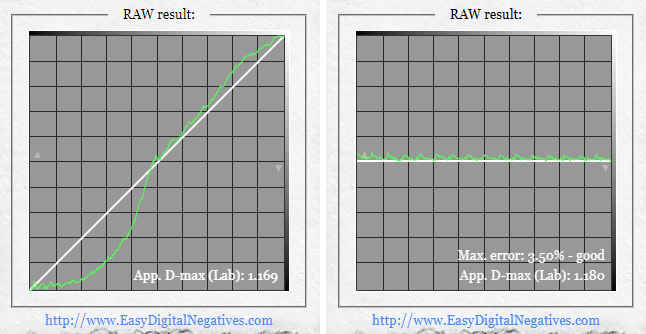
On the left, the values read from a fourth test print made with the same negative NEG23 show very small spikes compared to its three siblings (see previous image). On the right, it is the reading of the Coating quality test that shows some spikes.

Surprisingly, the new test print of the step tablet negative showed very little spikes compared to its three siblings, while the EDN coating quality test showed some spikes at the beginning of the rows.

I was puzzled and couldn’t understand the reason for those differences, but after some time of investigation and looking closely again at the newer step tablet test print I could see that its development/wash had been made much slower than normal because the print had a stain in the white areas (which you don’t want!), while the coating quality test showing spikes had been washed properly (doing more rocking) and had no stain. This was the major clue for better investigating the water flow.

Twin prints with a different behavior

To reduce variability and to average possible inconsistencies due to darkroom variables when test printing the step tablet to linearize my process, I printed two identical step tablet negatives, one beside the other, on the same transparency film.
That way I could coat, print and develop a single sheet of paper containing two step tablets, that I thought should be more or less identical. The interesting result was that the spikes, reading the values of the two test prints, were quite different.
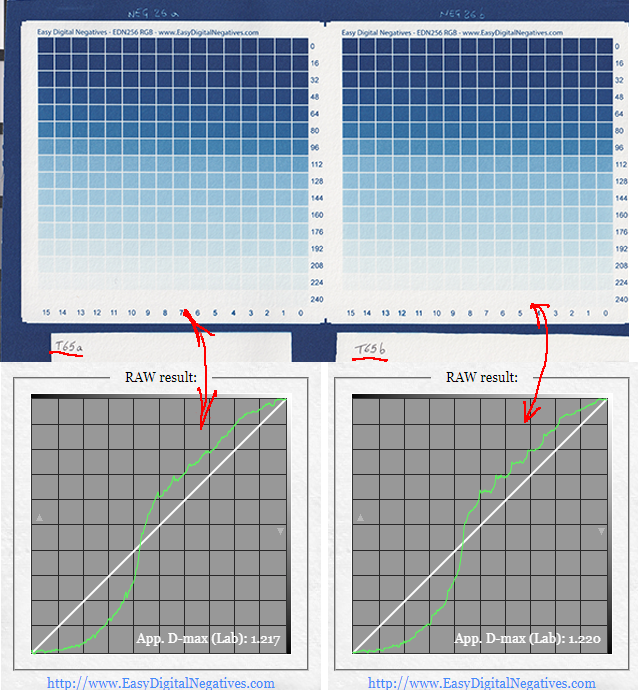
Above is a single test print made using a double but identical step tablet negative printed on a single transparency film. The spikes are different.

The different shape of the spikes was evident, although, for the information I had, I thought they should have been identical.
I started guessing here that the water flow could be playing a role, but a slight unevenness and/or other variables could also be a cause. I did many other tests, eventually ruling out all the other variables.

The differences between having spikes and not in your calibration process

It is important to get rid of the spikes. The spikes affect how faithful and precise your linearization will be. So either you know what you are doing and smooth them out while making your correction curve, or you use automation software to do it for you.
The EDN-free tool is engineered in a way that detects the spikes and smooths them to remove local irregularities while making the correction curve for you. Spikes, even sharp ones, are almost always a single isolated raw value that will be removed by smoothing. But if the spikes are wider, smoothing will not eliminate the issue completely and they will influence the correction curve.

In the example below you can see the raw values (purple color curve) of a test print I did using my new anti-spikes 256 step tablet. From those raw values, EDN creates a perfect correction curve (green color) that is specular (a mirror image) of the raw values, as it should be.
The correction curve generated from an almost spikeless test print is faithful and precisely represents the need to perfectly linearize your negative.
If you manually create your own correction curves, low spikes will give you little doubts on how to smooth them out.
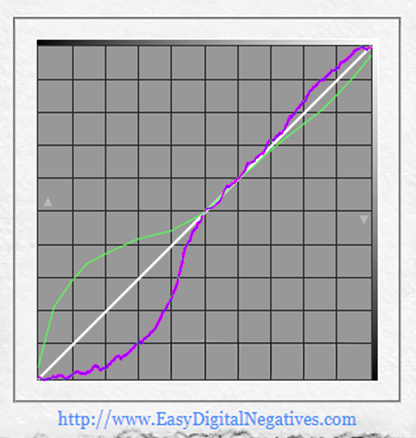
The raw values (purple color) of a test print I did using my new anti-spikes 256-step tablet, there are almost no spikes. The correction curve is in green.

In the example below you can see the raw values (purple) of a spiked test print and the correction curve (green) created by EDN.
EDN is able to take into consideration the existence of spikes when reading the raw values of your test print, compensate for them and so create a good correction curve.
Nonetheless, above a certain level spikes start making part of the equation when EDN creates the correction curve.
If you manually create your own correction curves, you need to know what you are doing and how to level those spikes out without interfering with good density values coming from your test print.

In the graph below I drew a yellow line above the diagonal to visually represent the raw values curve (purple color) if no spikes were present. I drew a specular yellow line (mirror image) below the diagonal, representing the correction curve needed in case no spikes were there. An area filled in yellow shows the gap from perfect linearization, in case no spikes were generated, to approximation of the correction curve due to the presence of spikes.
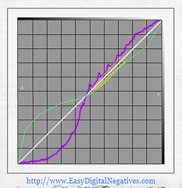
Spiked raw values are in purple and the corresponding correction curve is in green. An area filled in yellow shows the gap from perfect linearization, in case no spikes were generated.

Spikes are not a representation of a perfect test print but an external issue due to how the step tablet is made and the test print developed/washed. Removing the spikes is important, in order to work with better data and get more precise correction curves for the best linearization of our photographs.

APPENDIX C – Water flow examples

Below I show a couple images taken with my cell phone while developing a real print, inside a wider tray compared to the one I normally use when developing the smaller test prints of the step tablet.
As you can see the flow is not uniform over the print.
Different factors such as tray dimensions, quantity of water, dimensions ratio between print and tray, rocking, etc. differently affect the water flow.
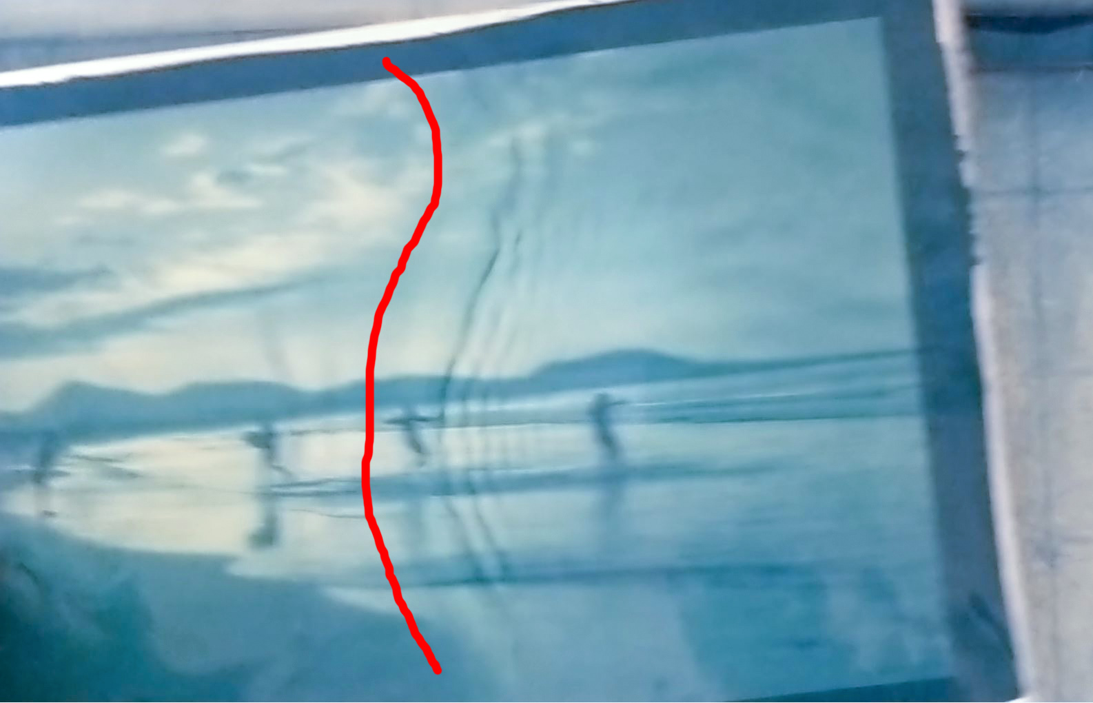
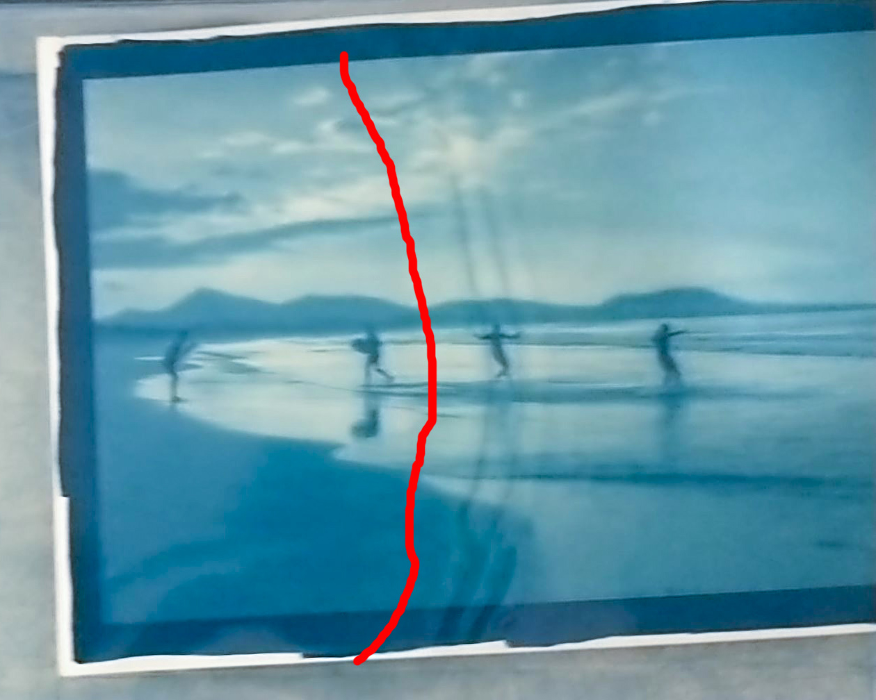
Water flow example 1
Water flow example 2

This is an external resource of the video course Digital Negative for Alternative Photography. You can read more about it in this website clicking HERE.

Darkroom Variables – Printer settings

What printer settings should be used for creating digital negatives?

Many print makers ask what are the correct printer settings to use to print their digital negative. The real answer is that there is no fixed true answer. It all depends on your process, i.e. the sum of all the variables you have when printing. 

Each printer – which is a variable of the process – has a set of inks and a printer driver that will give you a different print from another printer, and so a different UV filtering ability. We may certainly say that each printer combined with the printer settings and the software you use to print, plots a different UV filtering curve which means your result will be different if you change something.

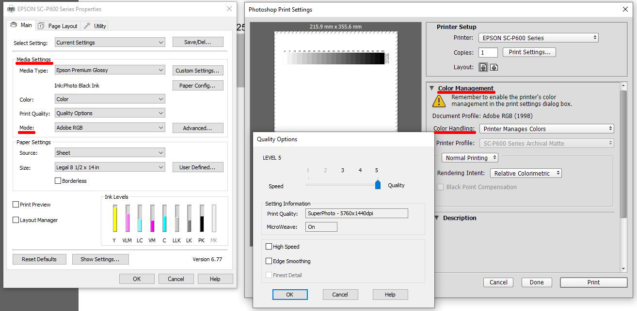
In a specific printer driver you can choose from many different settings like: the color space, the paper type, how it manages colors, etc. and each setting changes the rendition of colors in the print and so the UV filtering curve (more on that later on).

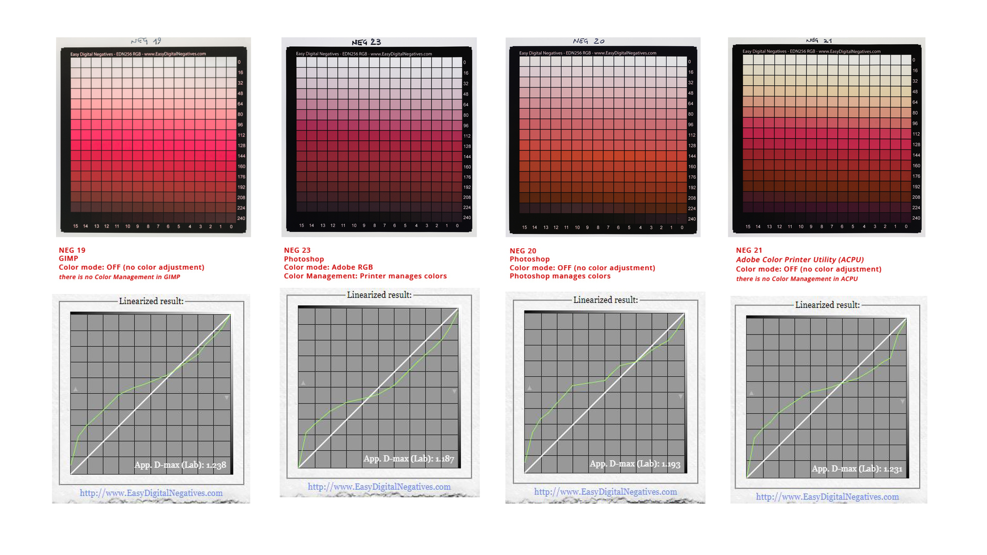
In my tests with my printer Epson P600 I used different settings in the printer driver and also used different softwares to print from (Photoshop, GIMP, Adobe Color Printer Utility) to see the differences in the final print.  Each test gave me a different result.

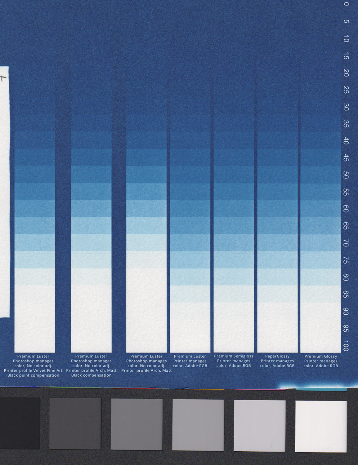
Inside Photoshop I have printed 7 strips of a 21 grey step tablet on a transparency film, changing paper type and color management settings in the printer driver for each print, in order to see what differences in density (UV filtering) those two settings can give.

7 strips of a 21 grey step tablet on a transparency film printed in Photoshop

I tested different paper type setting while printing on my transparency film:

  • Premium Luster
  • Premium Semigloss
  • Paper Glossy
  • Premium Glossy

And different color management:

  • Photoshop manages color
  • Printer manages colors

In my test, for my process, i.e. the sum of all the variables I have, including the printer, Printer manages color wins for now together with Premium Glossy paper. My decision was taken upon several considerations including the exposure scale I wanted to get, which is related to paper white point (more on that later on).

It is a test you may need to make if you don’t have paper white in your print, or if the correction curve you get out of your test print is too strong/rough. You may be able to find out, during the calibration of your digital negative, if one or more printer settings combined make the print of your negative denser than another or the correction curve smoother, which is better. I also tested other settings inside Photoshop, like the Color Mode “Adobe RGB” or “NO color management“. Some prefer using NO color management, but for my process it is not a good choice.

The actual version of GIMP (at the moment of this writing) doesn’t allow you to choose whether “GIMP manages colors” or “Printer manages colors”, the way you can choose inside Photoshop.

Adobe Color Printer Utility (also known as ACPU) is a system used to print with NO color management. The problem I had (inside Windows operating system) is that the print was done at the upper and leftmost point of the film and I couldn’t find the way to print it more centered, nor in 1:1 scale. So, not good for me.

How to test and select the best printer settings

To find your best printer settings you need to reach the point in the calibration process where you test print the step tablet to generate the correction curve.

Before that, following what I teach in my video course Digital Negative for Alternative Photography, you need to have done the following steps in the calibration process:

  • Found your Standard Exposure Time
  • Found your Optimal Color Blocker
  • Found paper white at the right point
  • Printed the negative of a plain 256 step tablet file with your optimal color blocker on top

The best settings are the ones that give you the smoothest correction curve, given you have paper white.

As you will be able to find through experimentation, if you use EDN calibration system, is that the EDN Optimal Color Blocker helps to have a smoother correction curve because of how it is engineered.

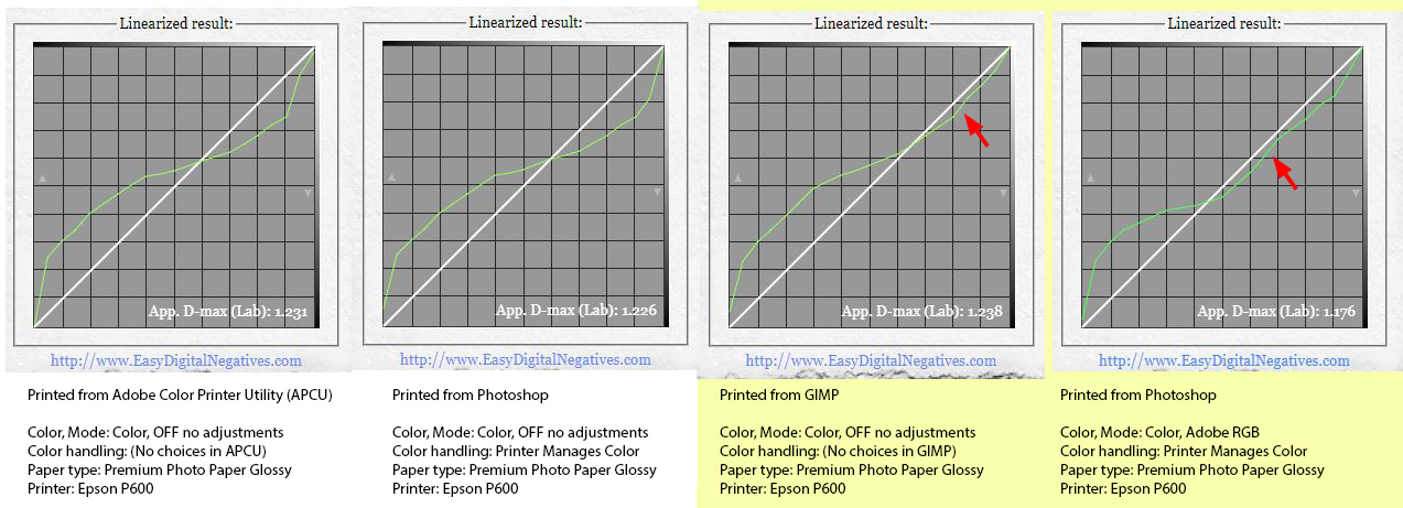
A comparison of 4 correction curves, created by the EDN tool for 4 different test prints. You can read the settings I used to print the 256 step tablet negative. 

In my case the best negatives are the last two (highlighted in yellow), printed with GIMP and with Photoshop. You can notice that the correction curves are in some parts already almost linear (adjacent to the diagonal line, which is where the correction curve will have to go after the linearization). 

The printer settings I use at the moment within Photoshop

It is not important for you to copy my settings because as I said they are right for my process (which is the sum of all my darkroom variables, not only the emulsion type I use) and so it might be better for you to do your printing tests if you want to get the best out of your calibration process.

I printed the same file using different software. It is a plain 256 step tablet with the same Optimal Color Blocker LUT on top. As you can see, the colour reproduction on the transparency film is very different, as well as the correction curve coming out from a test print made in cyanotype using those negatives.

Here you can see the difference that various settings can make

So, if you want to go into such detail, try to have fun in these tedious tests! 

Remember that it can be frustrating at the beginning but very rewarding at the end.

Always remember that the calibration process for your digital negatives needs to be performed keeping firm all your darkroom and printing variables (including the Relative Humidity, paper humidity) you have while performing your tests.

This is an external resource of the video course Digital Negative for Alternative Photography. You can read more about it in this website clicking HERE.
Darkroom Variables – Colorized negatives

Why do we colorize digital negatives?

At the beginning of the digital negative era, around the early and mid ‘90s, the inks of the digital printers had poor UV filtering ability compared to what you find today.

For printing in some Alternative Photographic processes that have an extended exposure scale like platinum palladium you need a very dense negative to block UV light so to have paper white in their very long exposures.

Dan Burkholder introduced the use of a colored negative in those years, because color inks had more UV filtering ability than the black ink at that time. He introduced a simple way to do it, but since then a lot has changed although it is still a valuable concept today.

An evolution in colorizing digital negatives.

The first technique to colorize a negative was by adding over the digital negative image, a new layer filled with a specific color, normally greenish or reddish chosen by experience.

An evolution happened to find a more precise color. With that you could find the best color matching your own printing process which is the sum of all your darkroom variables, not only the emulsion type you use, and give you a better result.

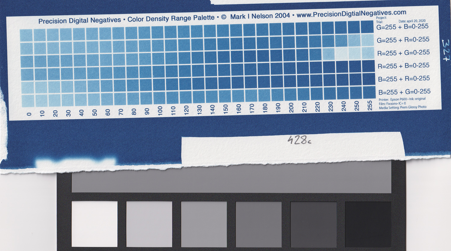
Mark Nelson created a calibration system called Precision Digital Negatives (PDN) where you can test what color you have to use with your process for best UV filtering property. His patented Color Palette only uses primary R, G, B colors, pure or mixed together, and no black. To make this system work, he tells you to use the printer setting NO color management so the printer uses the R, G, B inks only and NO black ink. His system is very well known and appreciated for the precision of its results.

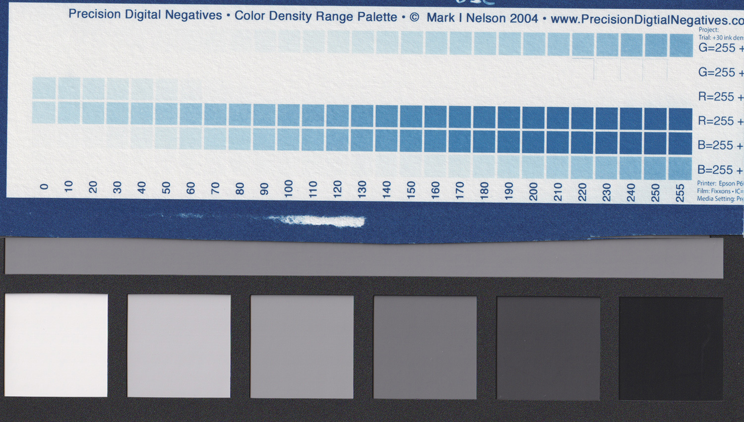
I tried it with classic cyanotype and printed the Color Palette using my Epson P600. I could not reach paper white in my test print using the standard (zero) ink level (quantity) while printing the Color Palette on the transparency film, so I had to raise my ink level through the printer driver (not all the printers allow you to do that) and finally had paper white.

Image 1: (Epson P600, standard (zero) ink density level, Color Palette test print, no paper white reached within the color steps)
Image 2: (Epson P600, raised +30 ink density level, Color Palette test print. A value of +10 ink density level would have probably sufficed to have one or more steps in paper white)

Nowadays the inks of the best inkjet photographic printers are of a very high quality and have a very high UV filtering ability, specifically when they are pigment based inks.
The printer drivers use modern technology and science to define how to mix all the inks to smoothly produce the tone you want, and the black inks give very high densities, enough to print a digital negative for classic cyanotype without having to raise the ink density level; on the contrary, you may find yourself lowering it a bit, depending what printer you use.

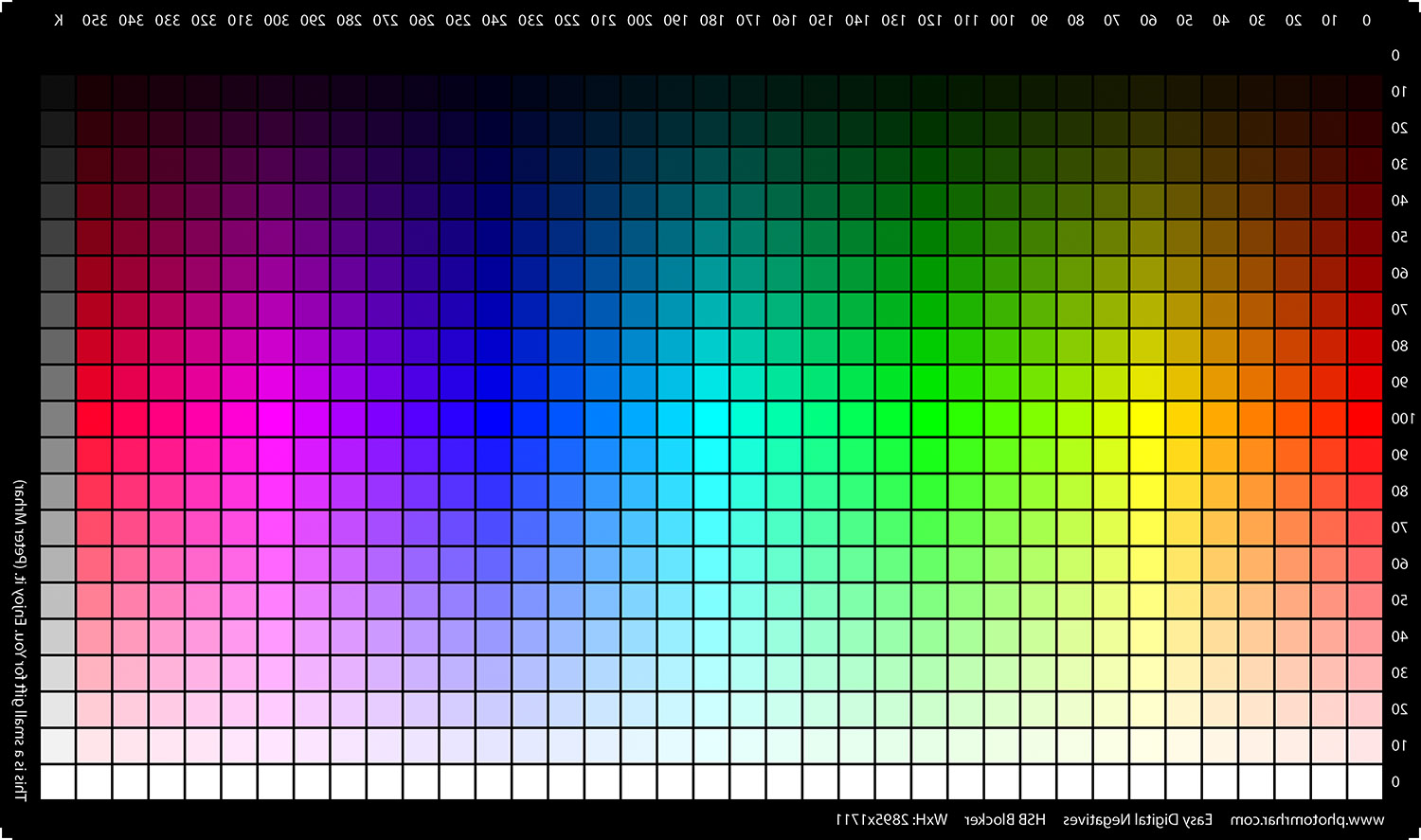
Peter Mrhar created a calibration system that I also use, called Easy Digital Negatives (EDN). The EDN Color Blocker free tool makes you use an HSB color image to define, with precision through a test print, the Optimal Color Blocker correct for your process.

Image 3: The image of the HSB file by EDN, ready to be printed on your transparency film.
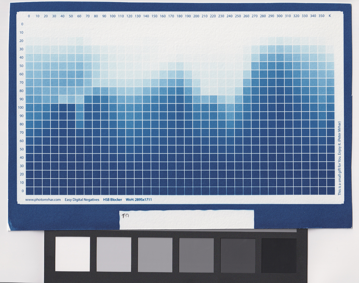
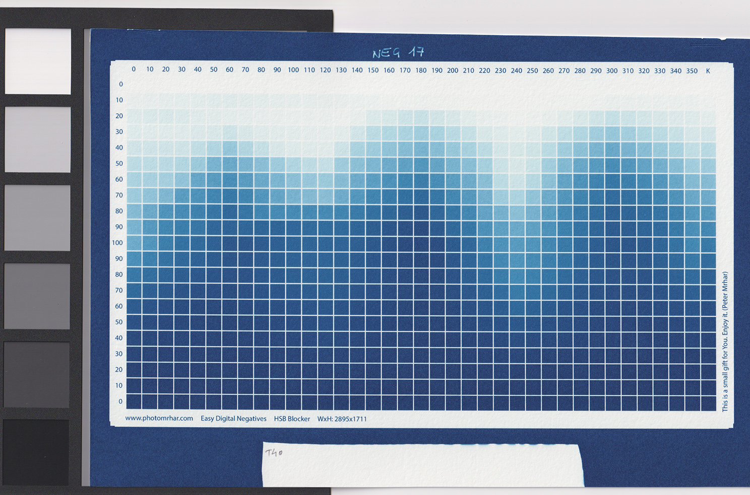
Image 4: I printed the EDN HSB “negative” at standard (zero) ink density level with my Epson P600. With no exposure scale correction (citric acid), the densities of the negative gave me paper white in excess.
Image 5: The negative of the HSB file was printed at standard (zero) ink density level with my Epson P600. I extended the exposure scale of this test print using citric acid in the development tray so to get the right amount of paper white. Paper white calibration was done printing the 256 step tablet.

There are many print makers using EDN that are not clear how the Color Blocker tool works, so I will give a short explanation.

The tool reads your HSB test print, like mine in classic cyanotype, and goes through the following important automatic checks:

  1. what colors give you “inversion of tone” (a) in the print and exclude them (e.g. color columns from 0 to 130 in the image above).
  2. what specific color, among those remaining available, gives you the most extended range of tones (b) to help the calibration (column 350 in the above image).

a) Being clear that the dark tones in a negative produce light tones on a print and lighter tones in a negative produce darker tones on a print, you have an “inversion of tone” in your print (someone calls it “solarization”) when a dark tone in your negative blocked less light than a lighter tone. This prevents your photo from having smooth gradients and faithful reproduction of tones.

b) When the EDN Color Blocker system chooses the color with the most extended range of tones means that you have more color difference/tonalities to reproduce the tonalities of your photo. Consider it as if you want to make a b/w pastel painting having 3 pastels only (black, medium grey, white) or if you have 6 different pastels in tones of grey instead. Of course having an extended range of pastels will give you better smoothness and transitions in the shades of your painting.

Without those two checks, a dense enough but wrong color may give you bad prints without you knowing it or understanding how to solve the problem.

This colorizing system gave me more than sufficient density to print my classic cyanotype with the standard (zero) ink density level of my printer Epson P600, since it uses all the inks including the black ink cartridge which in my case is a pigment based ink.

I could actually use a negative value of ink density in the printer driver (maybe -5, or -10) saving ink and faithfully print my cyanotypes.

As a matter of fact, having a digital negative that was a bit denser than needed created an area of paper white wider than desired (Image 4), so I decided to extend the tones of my print using some citric acid in my development stage (Image 5). This worked well with cyanotype, for other processes you might have other ways to control the general contrast, or you may choose to reduce your ink density if your printer allows that.

I find another very important advantage in the EDN Color Blocker tool. It lets you download your colorizing layer not only as a Gradient Map but also as a LUT file, and inside the LUT file the color hue chosen as your Optimal Color Blocker changes to adapt to the different areas of your photo (dark areas, midtones, highlights) and doing so you have the best color choice possible, creating the premise for a milder correction curve when calibrating your digital negative, and a mild correction curve means less artifacts and best precision in tone reproduction.

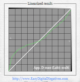
Generally speaking, the LUT file of the Optimal Color Blocker performs as a former correction of your negative, so that you’ll need a very light calibration curve. That curve depends also on the printer settings of your choice while printing your digital negative, that will be the subject for another article.

Image 6: The curve above shows the slight correction you need, to have a perfect linearized (calibrated) negative. It is the result of using the Optimal Color Blocker LUT file.

This is an external resource of the video course Digital Negative for Alternative Photography. You can read more about it in this website clicking HERE.
Darkroom Variables with Classic Cyanotype – Waiting time from coating to printing.

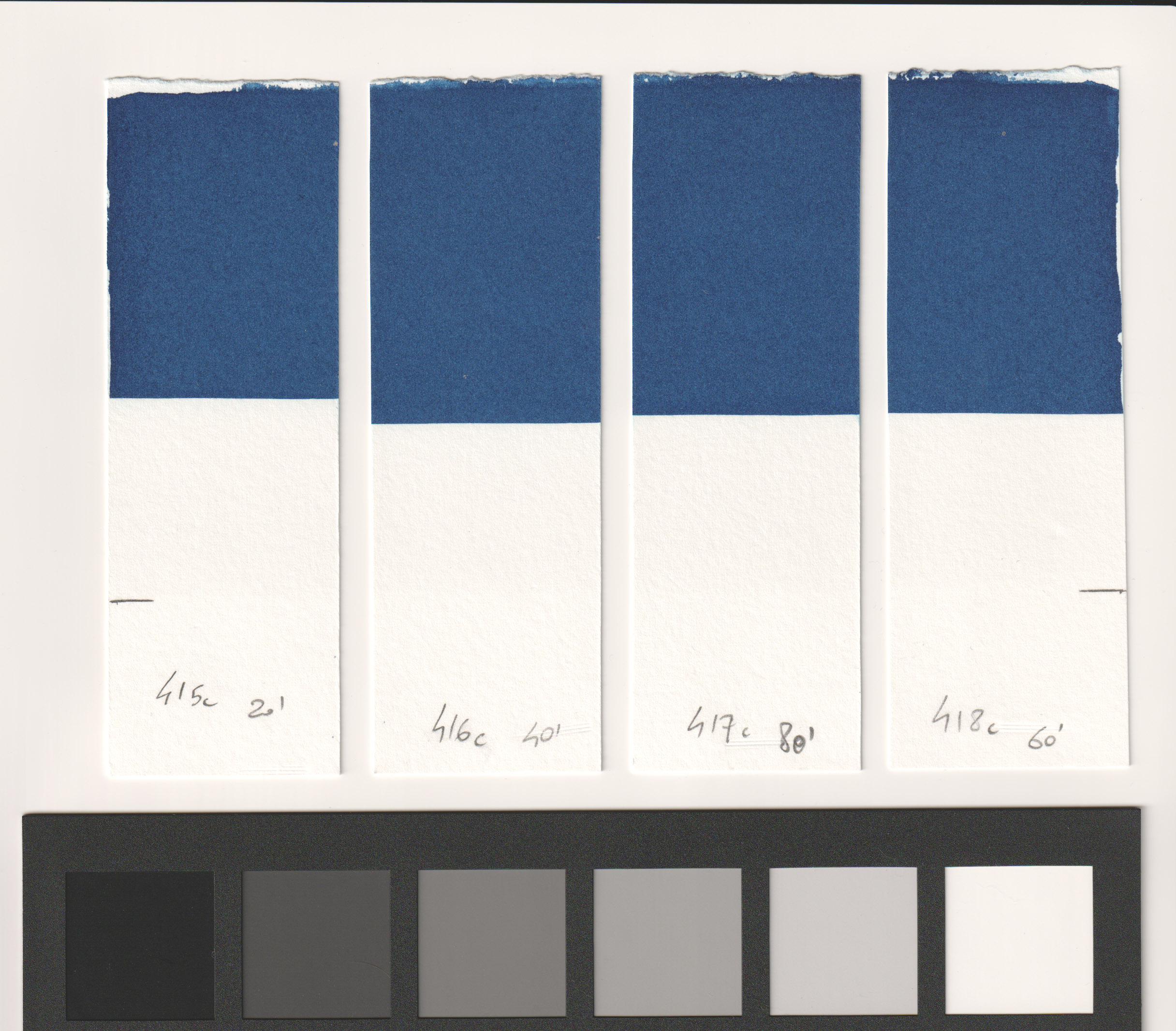
  • I coated a sheet of paper using a rod and very little emulsion (0,0025 ml/cm2) down to where I drew the pencil lines. I cut the sheet in four strips when dry. 
  • Room temperature was 22 deg C and Relative Humidity 74%. 
  • I waited 20 minutes from coating and printed the first quarter of the coated sheet (Test strip 415c) for 1 minute (a shorter exposure time than my standard so to better see any color variation when comparing it with the other prints). 
  • I covered a part of the coating with an opaque material to have a non exposed area where to check fogging.
  • I waited 40 minutes from coating before printing the second quarter of the sheet as above (Test strip 416c).
  • I waited 60 minutes from coating for the third quarter as above (Test strip 418c).
  • I waited 80 minutes from coating for the fourth quarter as above (Test strip 417c).

P.S. yes I mismatched the strips already numbered when printing so they are not in sequence, but correct.

At the end of the test I could see there was no difference in dMax (color density) in the four prints and the fog under the covered part was pretty similar and almost absent.

In my conclusions there is not much difference if you wait for 20 or 80 minutes to print after coating. 

P.P.S.  I always suggest not to wait too long from coating to printing otherwise fogging may become evident in some circumstances (depending on quantity of emulsion used and R.H. of your place) and your paper white may be less white, or gone. 

I tend to always wait from 45 to 60 min for consistency in my darkroom variables, the base for a perfect digital negative.

This is an external resource for cyanotype printing of the Digital Negative video course. You can read more about it clicking HERE.

Darkroom Variables with Classic Cyanotype – Alkaline buffered (acid free) papers

I used only acid free papers for quite a long time, before I started buying Arches Platine, a pure cotton rag with no alkaline reserve that gives me wonderful results with blue and turquoise shades.

Acid free papers such as watercolor papers often give very dark blues, even darker than Arches Platine and they are much cheaper, but they tend to bleach out when printing in cyanotype unless you adopt some countermeasures.

You have two ways to do so:

  • pre acidify your sheets of paper before using them for printing
  • compensate for the alkaline buffer when developing and washing your print.

I never pre acidify my paper because I don’t want to spend time working twice on a sheet of paper, but it might be the best practice, in fact if you pre acidify you end up printing with a neutral paper and this makes things good and easy.

If you coat your buffered paper the way it comes and print on it when the emulsion has dried, let’s say after one hour or so, you can perfectly compensate for the alkaline buffer when you develop and wash your paper immediately after printing.

In my tests I found that the alkaline buffer of Canson XL Aquarelle (or Watercolor, name depends on what market it is sold) can be perfectly compensated using 0,3 g/l of sulfamic acid put in all the dev. and washing baths, for at least 15 minutes, but 20 minutes are better for a complete wash.

Before Canson, I also used other buffered papers such as Fabriano Accademia and Caballo 109, and I always compensated for their alkaline buffer during wash.

Sulfamic acid has good properties when used with paper because it doesn’t interact badly with the paper itself and has no smelling fumes (unlike chloridric acid that I used when I began printing). But sulfamic acid is not super soluble so you need to warm up some water, up to 60-70 degrees Celsius (140-160 F), and then pour it on your acid crystals inside a capable container, then stir for a few minutes until complete dissolution.

I make a rough 10% solution (not exact in chemical practice) using 90 g of sulfamic acid crystals and 900 ml of water (0,9 liter).

When developing and washing the print that you have made on Canson XL Aquarelle (Watercolor) you need to put 3 ml of the sulfamic acid solution you have previously prepared per each liter of water you put in your trays.

For 20×30 cm (8×12 inches ca.) prints on Canson and classic cyanotype my 3 small trays are configured this way:

  1. 2 liters of water with 3 ml/l (in 10% solution) sulfamic acid, constantly rocking by hand for 1 minute (there is a lot of wash off).
  2. 2 liters of water with 3 ml/l (in 10% solution) sulfamic acid, rocking by hand for 4 minutes.
  3. 2 liters of water with 3 ml/l (in 10% solution) sulfamic acid, rocking (but less) by hand for 15 minutes.

You need to change the water in the first tray for each print (it gets very dirty) and you can use the water inside the second and third tray (with two liters of washing water each) for a maximum of three prints, this is because during washing the acid is slowly neutralized while compensating the alkaline buffer of the paper, so you need to have fresh water and acid to be always effective in washing the print and getting rid of the alkaline buffer.

If you want to use another type of acid, like citric acid (the worst option is chloridric acid), you’ll need to experiment with the quantities I suggested, since each acid has a different pH when diluted in water and so a different compensating ability.

If you want to use white vinegar you need to experiment too, you’ll need way more quantity.

Everything must be tested, defined and then kept consistent in your printing process, that is the base for a perfect digital negative.

This is an external resource for cyanotype printing of the Digital Negative video course. You can read more about it clicking HERE.

Darkroom Variables with Classic Cyanotype – Development and Washing

Washing your cyanotype in the best way is very important in order to have a print that will last beautifully.

If you don’t wash enough, some emulsion will remain inside the paper and it will show up in time as a yellow cast in the highlights. 

If you wash too much, you risk to wash off a bit of the darker areas of your print and so to reduce its overall contrast.

Water temperature, water pH, washing time, speed of agitation (rocking) are all factors that may give you a difference. You want to find your own way to develop and wash and keep it consistent, from the first test prints during the digital negative calibration to your real photo prints, because also from that depends the reliability of your digital negative calibration, and at the end the quality of your print.

I found that for my process with Arches Platine (a process consists of the sum of all the darkroom and printing variables including emulsion type, paper type, relative humidity, type of coating, etc) the best washing time was 20 minutes in total. 

My tap water is alkaline and to compensate it I need to use a little citric acid as follows. This is valid only for me, you need to check the pH of your tap water, for that I suggest you to use the liquid tests for aquariums which are more reliable than the paper strips. Also, I use a certain quantity of citric acid in the first development tray to widen the exposure scale in my prints but I’ll write more on that in a specific post.

For a 30×40 cm (12×16 inches ca.) print on Arches Platine and classic cyanotype my 3 trays are configured this way:

  • first tray: 2 liters of water with 5 ml/l (in 10% solution) citric acid, constantly rocking by hand for 3 minutes, print face up to avoid air bubble formations, with a continuous and rather quick (but not too much) rocking at least in the first minute when developing occurs to prevent staining from bleeding.
  • second tray: 10 liters of water with 0,3 ml/l (in 10% solution) citric acid, I use a small submerged aquarium pump because I get bored, (hence the 10 liters, otherwise 5 liters are enough if my pump can stay beside the print inside my tray) for moving water for 3 minutes, print face down, to clear most of the emulsion.
  • third tray: 5 liters of water with 0,3 ml/l (in 10% solution) citric acid, gently rocking by hand from time to time for the last 14 minutes, print face down.

For smaller prints like 25×25 cm (10×10 inches) I use 2 liters, 5 liters and 5 liters respectively in my 3 trays and if the prints are smaller I reuse the water of the second and third tray for washing more prints. I always change the water in the first tray for each print.

Washing for a total of 15 minutes was also good but the paper white was best at 20 mins, so that’s my washing variable defined for a perfect digital negative.

This is an external resource for cyanotype printing of the Digital Negative video course. You can read more about it clicking HERE.

Negativo Digital para Fotografía Alternativa

For English click here.

Soy feliz de ofrecerte el primer video curso profesional para hacer Negativos Digitales para Fotografía Alternativa. Es en Inglés con subtítulos en Inglés y en Castellano.

Para descubrir el curso haz click AQUÍ.

La preparación de este video curso ha llevado más de un año y medio. Mi experiencia previa, haciendo miles de impresiones utilizando negativos digitales, ha sido indispensable para comprender realmente todos los detalles que ahora puedo explicarte. Antes de tener la idea de hacer este video curso hice muchísimas pruebas para ampliar mi conocimiento sobre la linealización de un negativo digital y dominar todas las variables conectadas en imprimir en mi proceso, así para poder tener resultados bonitos y constantes. Trabajar con John Isner ha sido de gran ayuda.

Empecé en 2016 usando una impresora barata todo-en-uno y una manera basica para preparar mis negativos digitales. Vendía muchas impresiones y en 2017 mejoré mi equipamiento. Compré una cámara de formato completo, una impresora Epson P600, una nueva insoladora UV (hecha a mano) que bajaba mis tiempos de exposición. Compré una Tabla de Pasos Stouffer (step wedge) y preparé una tabla de tiempos sencilla da utilizar para hacer pruebas manuales de tiempos de exposición. Hice a mano un ” UV Dose Meter” para medir la exposición variable del sol. Escogí es sistema Easy Digital Negatives (EDN) de Peter Mrhar para calibrar mis negativos digitales así que podía concentrarme en editar mis fotos sin la necesidad de hacer todas las mediciones técnicas. En el curso utilizaré algunas herramientas modernas de EDN, independientes del editor de fotos que elijas, que son accesibles gratuitamente en la web.

This image has an empty alt attribute; its file name is neg-and-print-centollo.jpg
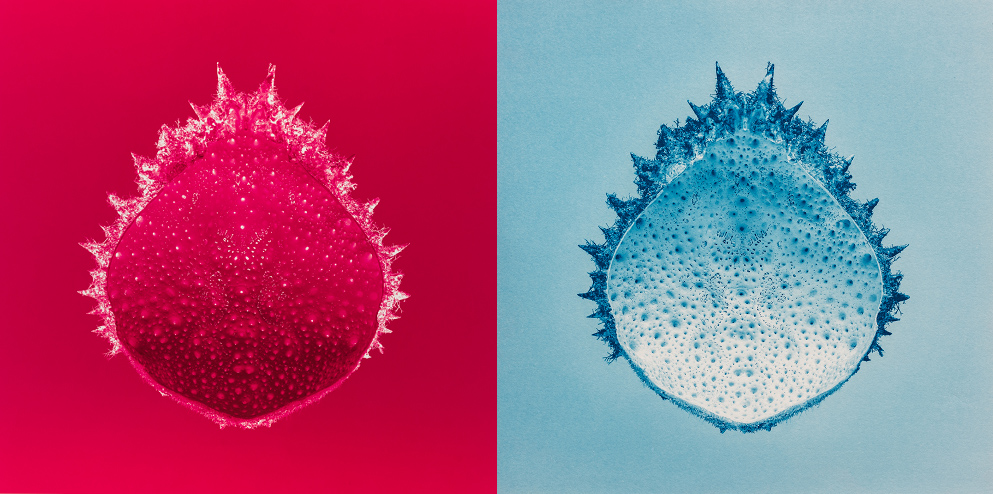
el negativo calibrato con su color bloqueador óptimo (EDN) y la impresión final en cianotipia clásica sobre Arches Platine


Necesitas saber como calibrar tu negativo digital si imprimes en procesos de fotografía alternativa como la Platinotipia, Cianotipia, Van Dyke Brown, Calitipia, Papel Salado, Crisotipia, Gum bichromate, Argirotipia, Impresión al Carbón, etc.

He abierto este video curso a los miembros de AlternativePhotography.com antes de hacerlo público. Muchos me ayudaron con sus interesantes comentarios. He tenido el honor de recibir reseñas de 5 estrellas por esos expertos profesionales!

This image has an empty alt attribute; its file name is review-1.png

Dentro del curso encontrarás muchas informaciones detalladas, y en cada lección hay un espacio donde poner preguntas a las que yo contestaré. Aunque el valor de este curso es alto he decidido, como es mi politica personal, de ofrecerlo al precio más bajo posible para mi, así que el más amplio público posible pueda inscribirse y disfrutarlo. Tienes acceso garantizado ilimitado de por vida cuando lo compras! Estoy seguro que ya has comprobado otros talleres (workshops) para hacer negativos digitales (dos o tres días prácticos) con precios hasta cienes o miles de dólares.

El video completo en video Negativos Digitales para Fotografía Alternativa está alojado en Thinkific, una plataforma profesional para video cursos. He preparado un video de introducción gratuito, que puedes ver antes de comprar, que describe conceptos importantes y los pasos del curso.

Para saber más y descubrir el video curso sobre el Negativo Digital haz click AQUÍ. Espero que te gustará el camino!